14 Dining Room Color Scheme Ideas That Feel Balanced
Choosing the right dining room color scheme is about more than following trends—it’s about creating a space that feels welcoming, cohesive, and visually calm while still making an impression. Because the dining room is where people gather, linger, and connect, the colors you choose should strike a perfect balance between warmth and style. Too bold, and the room can feel overwhelming. Too neutral, and it may lack personality. The most successful dining rooms find harmony by blending complementary tones, layering textures, and allowing one or two colors to gently lead the design.
From timeless neutrals and earthy hues to soft pastels and moody contrasts, balanced dining room color schemes can adapt to both modern and classic interiors. Whether your goal is an elegant formal dining space or a relaxed family-friendly room, these 14 Dining Room Color Scheme Ideas That Feel Balanced will help you create a polished look that feels intentional, comfortable, and effortlessly stylish.
1. Warm Beige and Crisp White

A warm beige and crisp white color scheme creates a dining room that feels calm, timeless, and incredibly versatile. Beige brings warmth without overpowering the space, while white keeps the room feeling fresh and open. This balance works beautifully in both small and large dining rooms, making it a safe yet sophisticated choice. Beige walls paired with white trim, ceilings, or cabinetry help define architectural details while maintaining visual softness.
To avoid a flat look, layer different textures such as linen curtains, woven rugs, or upholstered dining chairs. Wood furniture in light or medium tones enhances the warmth, while subtle metallic accents—like brushed brass or matte gold—add just enough elegance. This color scheme also allows artwork and table settings to stand out without competing with the walls. Overall, beige and white offer a balanced backdrop that adapts easily to seasonal decor changes, making it ideal for homeowners who love flexibility and timeless appeal.
2. Soft Gray and Natural Wood
Soft gray paired with natural wood tones creates a dining room that feels modern yet inviting. Gray provides a cool, neutral base that feels polished, while wood elements introduce warmth and organic character. This balance prevents the space from feeling too cold or overly rustic. Light gray walls work especially well with oak, ash, or walnut dining tables, creating a refined but relaxed atmosphere.
Incorporate wood through furniture, ceiling beams, or even flooring to ground the space. Gray upholstered chairs or curtains soften the look and tie the color scheme together. Black or charcoal accents—like lighting fixtures or frames—add subtle contrast without overwhelming the room. This combination is perfect for Scandinavian, contemporary, or transitional interiors. It feels effortlessly balanced, offering a clean aesthetic that still feels comfortable enough for long dinners and everyday use.
Read Also: 13 Colorful Laundry Room Ideas That Pop
3. Navy Blue and Warm White

Navy blue and warm white create a dining room that feels dramatic yet perfectly balanced. Navy adds depth and richness, while warm white keeps the space from feeling too dark or heavy. This combination works especially well when navy is used strategically—on an accent wall, lower wall paneling, or built-in cabinets—while white dominates the remaining surfaces.
The contrast feels intentional and elegant, making it ideal for formal dining rooms or statement spaces. Gold or brass accents elevate the look, giving the room a refined finish without appearing flashy. To keep the space inviting, use soft lighting and light-colored textiles. Navy and warm white strike a perfect balance between boldness and restraint, making the dining room feel stylish yet welcoming.
4. Sage Green and Cream
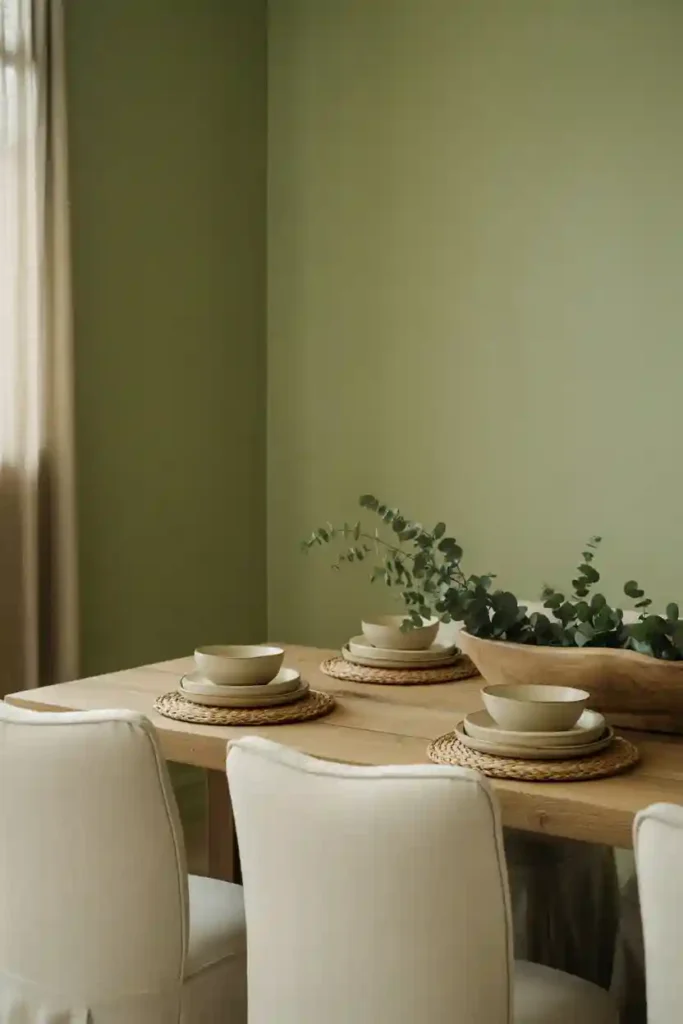
Sage green and cream offer a soothing, nature-inspired color scheme that feels effortlessly balanced. Sage green introduces a soft hint of color without overpowering the room, while cream adds warmth and light. Together, they create a relaxed atmosphere perfect for everyday dining and casual entertaining.
Sage works beautifully on walls, cabinetry, or even upholstered dining chairs. Cream ceilings, trim, or curtains help reflect light and keep the room airy. Natural materials like wood, stone, and woven textures enhance the organic feel of this palette. This color scheme pairs well with both modern and farmhouse styles. It’s calming, timeless, and easy to decorate around, making it ideal for those who want a subtle touch of color without sacrificing balance or elegance.
5. Charcoal and Soft Taupe

Charcoal and soft taupe create a sophisticated dining room that feels moody yet balanced. Charcoal adds depth and drama, while taupe softens the look with warmth and neutrality. This pairing works best when charcoal is used in moderation—on an accent wall or furniture—while taupe anchors the rest of the space.
Taupe walls or upholstery keep the room from feeling too dark, while charcoal chairs, lighting, or wall paneling add contrast. Metallic accents in silver or brushed nickel enhance the modern feel without overwhelming the palette. This color scheme is ideal for contemporary dining rooms or spaces that transition from dining to living areas. It feels refined, intentional, and perfectly balanced between bold and neutral.
6. Terracotta and Warm Neutral

Terracotta paired with warm neutrals creates a dining room that feels cozy, grounded, and full of character. Terracotta brings earthy warmth and personality, while neutral tones like beige, ivory, or sand keep the look balanced and approachable. This combination works especially well in homes that embrace natural textures and Mediterranean or bohemian influences.
Use terracotta as an accent—on walls, artwork, or textiles—rather than overwhelming the entire room. Neutral walls and furniture allow the terracotta tones to shine without dominating. Wooden furniture, clay accessories, and soft fabrics complete the look. This color scheme feels inviting and relaxed, making the dining room a place people want to linger. It’s bold enough to be interesting but balanced enough for everyday comfort.
7. Black and Soft Beige
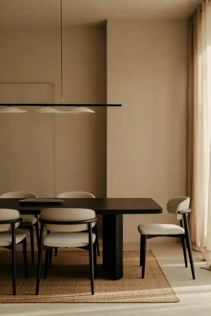
Black and soft beige form a striking yet balanced dining room color scheme. Black adds structure and definition, while beige softens the contrast and keeps the space welcoming. This pairing works well in modern or minimalist dining rooms where clean lines and simplicity matter.
Use black sparingly—on chairs, lighting fixtures, or window frames—while beige dominates walls and larger surfaces. The softness of beige prevents the room from feeling stark or cold. Add natural textures like wood or linen to enhance warmth. This color scheme feels intentional and polished, offering contrast without chaos. It’s perfect for those who love bold design but still want a calm, livable dining space.
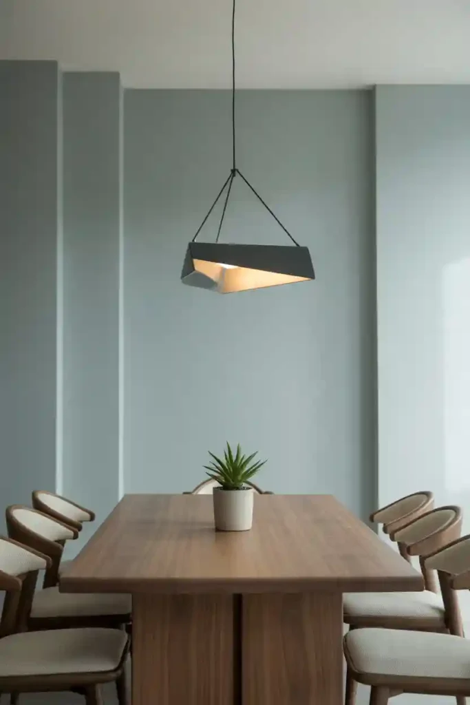
8. Dusty Blue and Light Gray

Dusty blue and light gray create a dining room that feels airy, calm, and balanced. Dusty blue adds gentle color without overpowering the space, while light gray keeps the palette neutral and refined. This combination works beautifully in coastal-inspired or contemporary interiors.
Use dusty blue on walls or upholstered chairs, and keep gray for trim, rugs, or curtains. White accents help brighten the room and enhance the softness of the palette. Light wood furniture complements both tones, adding warmth. This color scheme feels peaceful and elegant, making the dining room a relaxing place to gather. It’s subtle yet stylish, offering visual interest without overwhelming the senses.
9. Olive Green and Warm Wood
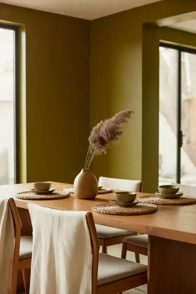
Olive green and warm wood create a rich, earthy dining room that feels grounded and balanced. Olive green adds depth and sophistication, while warm wood tones keep the space inviting. This combination works especially well in homes that embrace natural or organic design elements.
Olive green walls or cabinetry pair beautifully with walnut or oak furniture. Neutral textiles in cream or beige help soften the look and prevent it from feeling too dark. Subtle metallic accents add polish without distracting from the earthy palette. This color scheme feels timeless and comforting, making it ideal for both formal dinners and everyday meals. It strikes a perfect balance between bold color and natural warmth.
10. Blush Pink and Soft Gray

Blush pink and soft gray create a dining room color scheme that feels gentle, modern, and beautifully balanced. Blush pink introduces warmth and subtle personality without overpowering the space, while soft gray grounds the look with a neutral, sophisticated base. This combination works especially well in dining rooms where you want a welcoming atmosphere that still feels polished and intentional.
Blush can be used on an accent wall, upholstered dining chairs, or even artwork to bring a soft glow into the room. Gray walls, rugs, or cabinetry help keep the color scheme from feeling too sweet or overly decorative. To elevate the look, incorporate metallic accents like brushed gold or rose gold lighting fixtures, which complement blush tones effortlessly.
11. Cream and Rich Brown

Cream and rich brown form a timeless dining room color scheme that feels warm, grounded, and perfectly balanced. Cream acts as a light-reflecting base, making the room feel open and airy, while rich brown tones add depth and visual weight. This pairing is ideal for dining rooms that aim to feel inviting yet refined.
Cream walls or ceilings help brighten the space, especially in rooms with limited natural light. Rich brown elements—such as a solid wood dining table, leather chairs, or dark flooring—anchor the design and provide contrast without feeling heavy. Layering textures like woven rugs, linen curtains, or ceramic accessories adds dimension and prevents the palette from looking flat.
12. Mustard Yellow and Neutral Gray
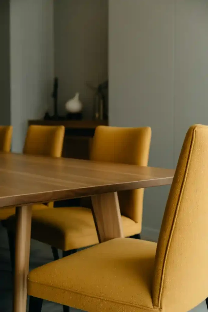
Mustard yellow and neutral gray create a dining room color scheme that feels energetic yet balanced. Mustard yellow adds warmth, optimism, and a bold pop of color, while neutral gray tones keep the space grounded and visually calm. This pairing is perfect for homeowners who want personality without overwhelming the room.
Mustard works best as an accent—on dining chairs, a feature wall, artwork, or decorative accessories—allowing it to stand out without dominating the space. Gray walls or cabinetry provide a stable backdrop that balances the vibrancy of yellow. White trim or light wood furniture helps soften the contrast and keep the room feeling open.
13. White, Gray, and Natural Greenery

A white, gray, and natural greenery color scheme creates a dining room that feels fresh, open, and perfectly balanced. White acts as the foundation, reflecting light and making the room feel spacious, while soft gray adds subtle contrast and depth. The introduction of natural greenery brings life and warmth, preventing the space from feeling too minimal or sterile. This trio works beautifully in modern, Scandinavian, and transitional dining rooms.
White walls or ceilings establish a clean backdrop that allows furniture and decor to stand out. Gray dining chairs, rugs, or sideboards help ground the space without overwhelming it. Greenery—such as potted plants, hanging vines, or botanical centerpieces—adds an organic touch that softens the neutral palette. Natural materials like wood, linen, and stone further enhance the balanced look.
14. Deep Teal and Soft Beige
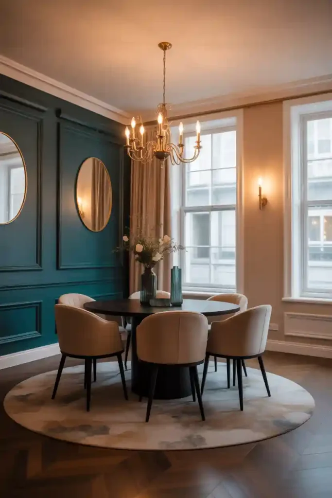
Deep teal and soft beige create a dining room color scheme that feels bold yet beautifully balanced. Teal introduces richness, depth, and a sense of sophistication, while beige softens the overall look, ensuring the space remains warm and welcoming. This combination is ideal for homeowners who want a statement color without overwhelming the room.
Deep teal works best on an accent wall, built-in cabinetry, or statement furniture, allowing the color to stand out while beige walls, rugs, or upholstery keep the space grounded. Warm lighting enhances the depth of teal, while beige tones reflect light and maintain an airy feel. Metallic accents in brass or gold add an elegant finishing touch.
Final Words
Creating a dining room that feels balanced starts with choosing a color scheme that blends style, comfort, and harmony. Whether you gravitate toward soft neutrals, earthy tones, or subtle pops of color, the key is ensuring each shade complements the others without overpowering the space.