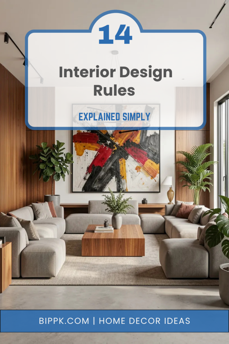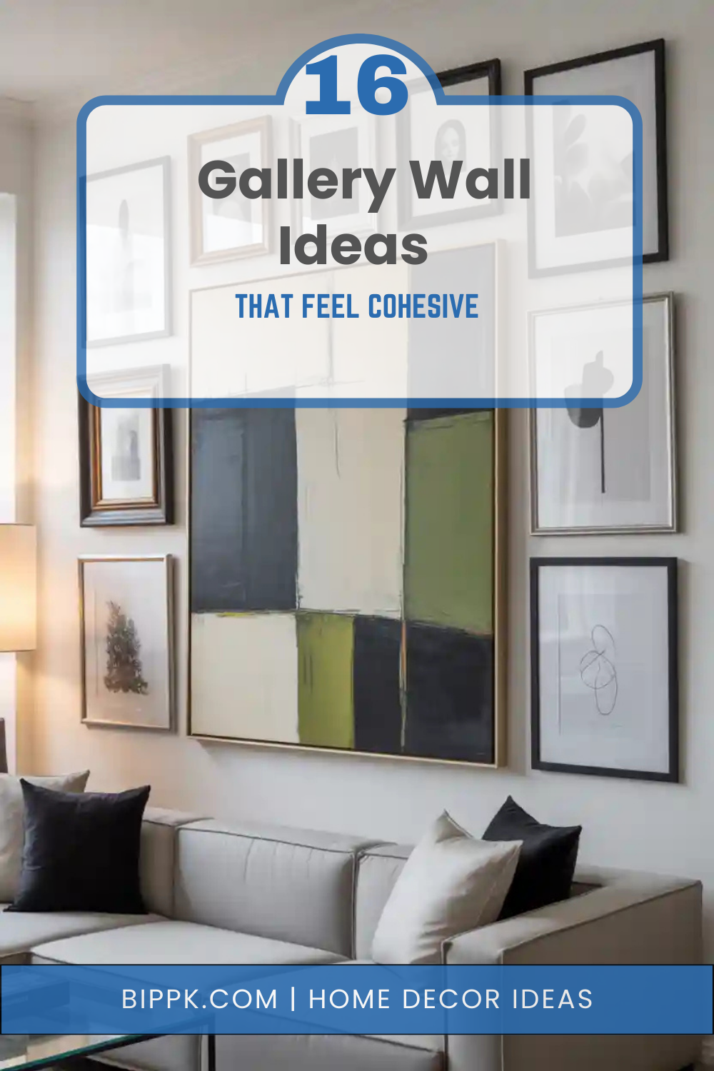
16 Gallery Wall Ideas That Feel Cohesive
A gallery wall is more than a collection of frames—it’s a visual story that brings personality, balance, and depth to a space. When done right, it can transform a blank wall into a focal point that feels curated rather than chaotic. The challenge many homeowners face is making a gallery wall feel cohesive instead of cluttered. With the right mix of layout, color, spacing, and theme, even a large collection of art can look intentional and harmonious.
Whether you’re styling a living room, hallway, bedroom, or staircase, a cohesive gallery wall helps tie your décor together and elevate the overall atmosphere. From matching frames to carefully chosen color palettes and meaningful artwork, small design choices make a big difference. These 16 gallery wall ideas that feel cohesive will guide you through different styles and approaches, helping you create a wall that feels unified, stylish, and uniquely yours—no interior designer required.
1. Matching Frame Gallery Wall
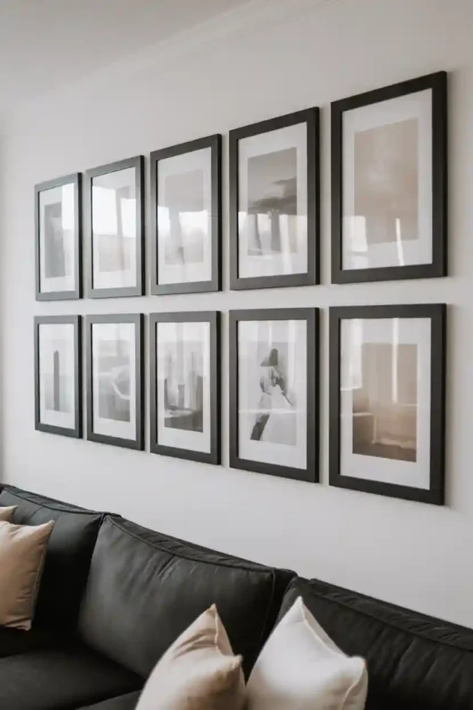
Using matching frames is one of the easiest ways to create a cohesive gallery wall. When every frame shares the same color, material, and thickness, the wall instantly feels organized and intentional. This approach works beautifully in modern, minimalist, or Scandinavian interiors where simplicity is key. Black frames create contrast, white frames feel airy, and wood frames add warmth. Even if the artwork inside varies—photos, illustrations, or typography—the consistent framing ties everything together.
Spacing matters just as much as frame choice. Keep equal gaps between each frame to maintain visual rhythm. Lay the arrangement out on the floor first to test balance before hanging. This style is perfect for living rooms or home offices where you want visual impact without distraction. It also photographs beautifully, making the wall feel editorial and polished.
2. Color-Palette Focused Gallery Wall
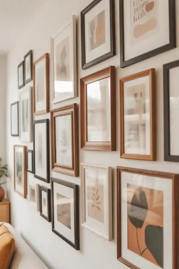
A color-coordinated gallery wall feels cohesive even when frame styles and art types vary. The secret lies in limiting the artwork to a specific color palette. Choose two to four colors that already exist in your room. This could be soft neutrals, earthy tones, or bold hues like navy and rust. When all pieces share these colors, the wall feels unified rather than random.
This idea works well for eclectic or boho interiors where variety is welcome but balance is essential. Abstract art, photography, and graphic prints all fit as long as the colors stay consistent. To enhance cohesion, repeat colors evenly across the wall. Avoid clustering similar tones in one area. This creates a smooth visual flow that guides the eye naturally.
Read Also: 12 Home Office Lighting Ideas That Reduce Strain
3. Grid Layout Gallery Wall
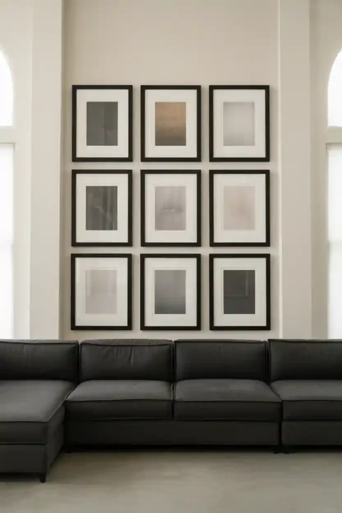
A grid layout creates instant order and cohesion. Frames are aligned in precise rows and columns, giving the wall a structured, gallery-like feel. This style works best with frames of the same size, though mixing artwork styles inside keeps it interesting. Grids are ideal for modern, transitional, and contemporary spaces where clean lines matter.
Because the layout is symmetrical, the eye reads the collection as one unit rather than individual pieces. This makes it perfect for large walls where visual calm is needed. Measure carefully and use a level when hanging. Even small misalignments can disrupt the crisp effect. The result is timeless, balanced, and effortlessly cohesive.
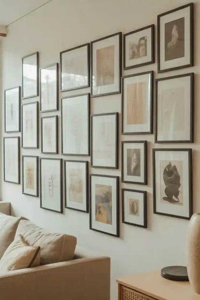
4. Black-and-White Artwork Gallery Wall

Limiting artwork to black and white is a powerful way to achieve cohesion. Without color competing for attention, the wall feels calm, refined, and intentional. This approach works well in both modern and classic interiors. Photography, sketches, typography, and architectural prints all shine in monochrome.
You can mix frame styles or sizes without losing harmony because the color palette remains consistent. This makes it ideal for those who love variety but still want control. Black-and-white gallery walls are especially striking in bright rooms, adding contrast without overwhelming the space.
5. Theme-Based Gallery Wall
A theme-based gallery wall is one of the most effective ways to make a collection feel cohesive and intentional. When every piece of artwork connects through a shared subject, the wall naturally tells a unified story. Popular themes include travel photography, botanical prints, abstract shapes, vintage illustrations, fashion sketches, or family memories.
The key to success is committing fully to the theme. Even if the art styles differ—photography mixed with illustrations, for example—the shared subject matter keeps everything visually aligned. This approach works especially well in hallways, staircases, and living rooms where storytelling adds emotional depth. To strengthen cohesion, use similar frame colors or materials. Black, white, or wood frames work well depending on your interior style. Keep spacing consistent so the wall doesn’t feel scattered. A themed gallery wall feels personal, curated, and meaningful. Instead of looking like random décor, it becomes a visual narrative that draws people in and invites conversation.
6. Same-Size Frame Gallery Wall
Using frames of the same size is a simple yet powerful way to create a cohesive gallery wall without limiting creativity. When every frame shares identical dimensions, the wall instantly feels organized, even if the layout is more relaxed or asymmetrical. This approach allows you to mix artwork styles freely. You can combine photography, abstract art, typography, or illustrations while still maintaining visual harmony. The uniform size acts as a unifying element that keeps the wall from feeling chaotic.
Same-size frames are especially useful for beginners. Planning becomes easier, spacing feels more natural, and the overall result looks intentional rather than improvised. This style works beautifully in bedrooms, home offices, and casual living spaces. For best results, lay the frames on the floor first and experiment with different arrangements. Keep spacing consistent to enhance cohesion. The final look feels balanced, approachable, and effortlessly stylish.
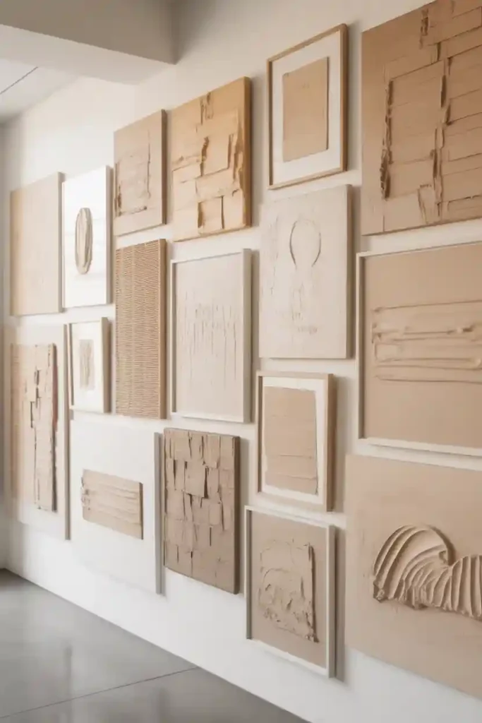
7. Neutral Frame Gallery Wall
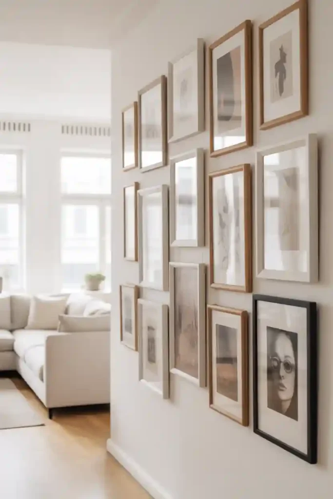
A neutral frame gallery wall creates cohesion through subtlety and restraint. By sticking to frames in white, beige, soft gray, or light wood, the wall feels calm, unified, and timeless. Neutral frames act as a quiet backdrop, allowing the artwork itself to shine without visual competition.
This style is perfect for minimalist, coastal, Scandinavian, or modern interiors where simplicity is key. Because the frames blend seamlessly with most wall colors, the gallery wall feels integrated rather than overpowering. You can mix different art styles—photography, line art, abstract prints—without losing harmony. Neutral frames are also incredibly versatile. If you change your décor or color scheme later, the gallery wall will still work beautifully. Keep spacing even and layouts balanced for a polished finish. The result is a cohesive gallery wall that feels light, elegant, and effortlessly sophisticated.
8. Center-Anchored Gallery Wall
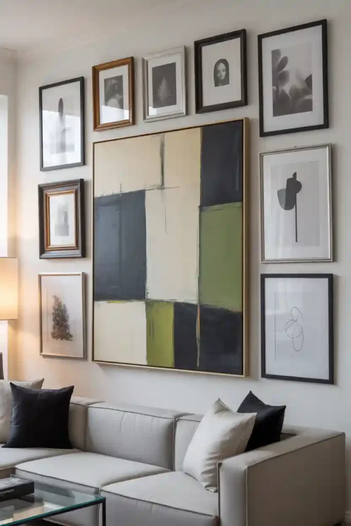
A center-anchored gallery wall creates cohesion by establishing a clear visual focal point. The design begins with one larger piece of artwork placed at the center of the wall. This central piece acts as the anchor, while smaller frames are arranged around it in a balanced, supportive layout.
This approach works especially well above sofas, beds, or console tables, where visual symmetry helps ground the space. Even when the surrounding artwork varies in size or style, the central anchor provides structure and order. The eye naturally returns to the main piece, making the entire arrangement feel intentional rather than scattered. To keep the wall cohesive, choose frames in similar colors or finishes and maintain consistent spacing around each piece. Avoid overcrowding the center so it remains dominant. A center-anchored gallery wall feels curated, polished, and thoughtfully designed, making it ideal for both modern and transitional interiors.
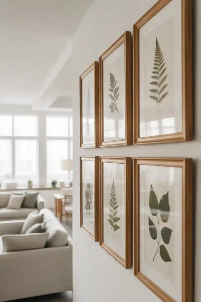
9. Wood-Tone Frame Gallery Wall
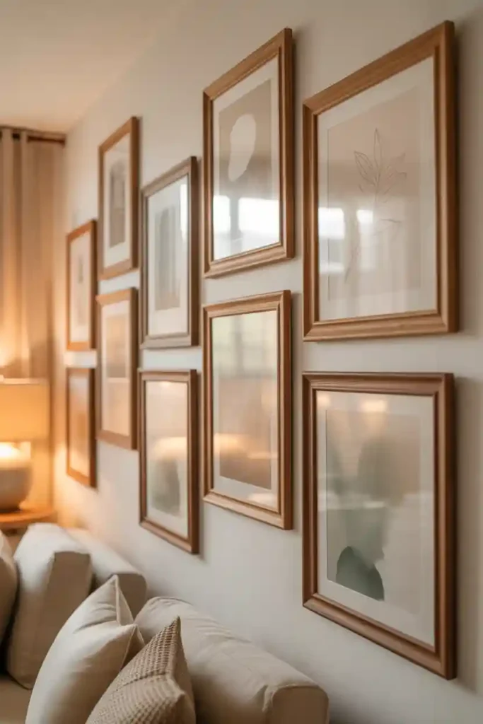
A wood-tone frame gallery wall brings warmth and cohesion through natural materials. By sticking to frames made from wood or wood-look finishes, the wall feels unified even if the artwork inside varies. Light oak, warm walnut, or soft maple tones work particularly well for creating harmony.
This idea fits beautifully into rustic, farmhouse, Scandinavian, and modern organic interiors. Wood frames naturally connect to other elements in the room, such as furniture, flooring, or shelving, which strengthens the overall cohesion of the space. To avoid visual clutter, keep the wood tones within the same color family rather than mixing very dark and very light finishes. Consistent spacing and a well-planned layout help maintain balance. The final result is a gallery wall that feels cozy, intentional, and visually grounded, adding texture and warmth without overwhelming the room.
10. Minimal-Spacing Gallery Wall

A minimal-spacing gallery wall creates cohesion by visually grouping all artwork into a single, unified statement. When frames are placed close together, the wall reads as one large installation rather than separate pieces, which instantly reduces visual chaos.
This approach works especially well for eclectic collections with varied art styles, colors, or frame designs. Tight spacing minimizes distractions and helps the eye move smoothly across the wall. It’s ideal for creative spaces, living rooms, or staircases where bold expression is welcome but cohesion is still important. Careful planning is essential. Lay out the arrangement first and keep gaps consistently small to maintain balance. Avoid uneven spacing, as it can make the wall feel accidental rather than intentional. When done correctly, a minimal-spacing gallery wall feels energetic, curated, and stylish while still maintaining a strong sense of unity.
11. Typography-Only Gallery Wall
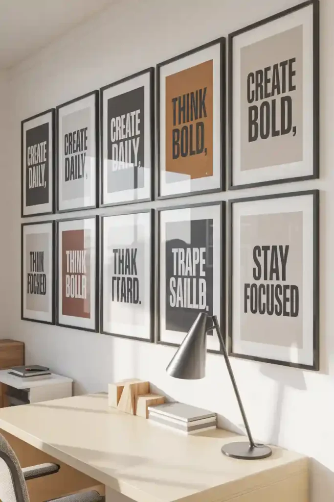
A typography-only gallery wall feels cohesive because it relies on words rather than images to create visual unity. When every piece features text—quotes, single words, letters, or phrases—the wall instantly feels connected, even if fonts or layouts vary slightly. This style works especially well in home offices, kitchens, hallways, and creative spaces where expression and personality matter. To maintain cohesion, limit your color palette to two or three shades. Black, white, and soft neutrals are timeless, while muted colors can add warmth without overwhelming the space.
Font selection is key. Mixing a few complementary fonts keeps the wall interesting, but avoid using too many styles. Consistent spacing and similar frame tones help bring everything together visually. A typography-only gallery wall feels modern, intentional, and expressive. It communicates mood and meaning while maintaining a clean, cohesive design that never feels cluttered.
12. Family Photo Gallery Wall
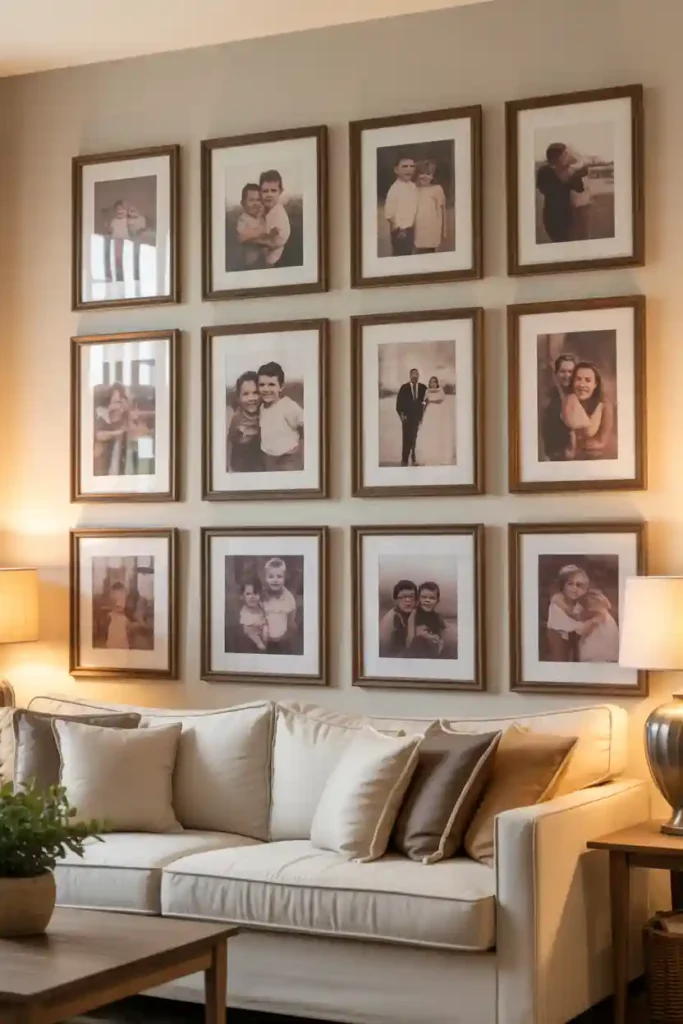
A family photo gallery wall creates cohesion through emotional connection and consistent presentation. While the photos themselves may span different moments and memories, using a unified editing style ties everything together visually. Black-and-white photos are a popular choice because they eliminate color distractions and feel timeless. Alternatively, you can use warm-toned or softly muted edits for a more relaxed, inviting look. Matching frames or frames in similar finishes further strengthen the sense of unity.
This type of gallery wall works beautifully in living rooms, hallways, or staircases where personal storytelling adds warmth. Keep spacing even and layouts balanced to avoid a cluttered appearance. A family photo gallery wall feels personal, meaningful, and cohesive. It transforms memories into décor, creating a space that feels lived-in, welcoming, and visually harmonious.
13. Art-Style Consistent Gallery Wall
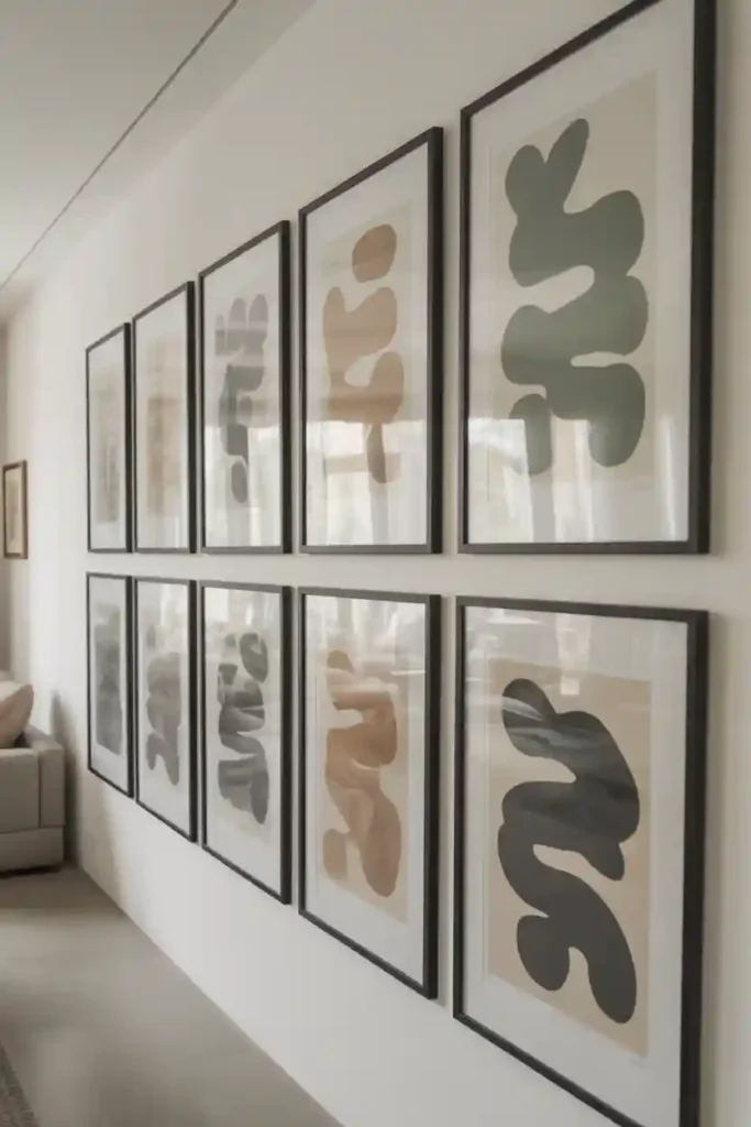
An art-style consistent gallery wall achieves cohesion by focusing on a single artistic approach rather than subject or color. When all pieces share the same style—such as abstract art, line drawings, watercolor paintings, or minimalist sketches—the wall feels curated and intentional. This method allows flexibility with color and composition while maintaining visual harmony. Even bold or varied shades work well together because the shared artistic technique connects them. It’s an excellent option for art-focused interiors or contemporary spaces where design impact matters.
To enhance cohesion, choose frames in similar finishes and maintain consistent spacing throughout the layout. Let the artwork breathe without overcrowding the wall. An art-style consistent gallery wall feels refined and thoughtfully designed. It gives the impression of a private collection rather than random décor, elevating the entire room with a cohesive, gallery-like presence.
14. Symmetrical Gallery Wall

A symmetrical gallery wall creates instant cohesion through balance and repetition. This layout relies on mirrored placement, where frames on one side of the wall visually match those on the other. Because the eye naturally seeks balance, symmetry makes the arrangement feel calm, intentional, and polished. This style works especially well in formal spaces such as dining rooms, entryways, or above a console table. Frames are usually the same size or closely related in scale, which strengthens the unified look. Even when artwork varies, the symmetrical structure keeps everything visually connected.
Careful measuring is essential for this approach. Equal spacing between frames helps maintain harmony and prevents the wall from feeling uneven. A symmetrical gallery wall feels timeless and elegant, making it ideal for homeowners who prefer a refined, structured aesthetic that never goes out of style.
15. Soft Color Gallery Wall
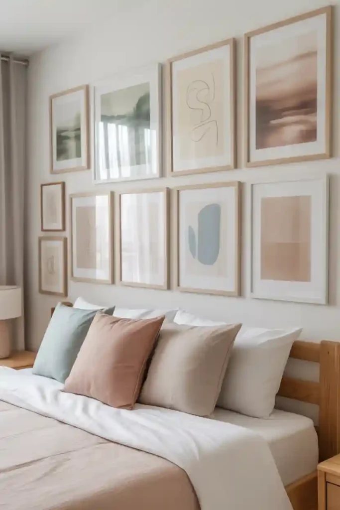
A soft color gallery wall achieves cohesion through gentle, muted tones that blend seamlessly together. Pastels, warm neutrals, and washed-out hues create a calming effect, making the wall feel unified and soothing rather than visually busy.This approach is perfect for bedrooms, nurseries, and cozy living spaces where a relaxed atmosphere is key. Artwork can vary in subject matter, but keeping the colors within the same soft range ensures harmony. Light-colored frames or thin neutral borders enhance the airy feel.
Spacing should remain consistent to avoid visual clutter. Soft color gallery walls pair beautifully with natural light, creating a serene and welcoming environment. The overall look feels thoughtful, cohesive, and effortlessly stylish, adding personality without overwhelming the space.
16. Monochromatic Gallery Wall
A monochromatic gallery wall creates strong cohesion by using a single color family throughout the entire arrangement. By varying shades, tones, and textures within that color, the wall feels layered and dynamic while remaining unified. This style works particularly well in modern and contemporary interiors where bold yet controlled design choices stand out. Beige, gray, navy, or even deep green monochromatic palettes can feel sophisticated when done correctly. The key is contrast—mix light and dark variations to prevent the wall from looking flat.
Consistent framing and balanced spacing help reinforce the cohesive effect. A monochromatic gallery wall feels intentional, high-end, and visually striking, making it an excellent statement feature that still maintains harmony with the surrounding décor.
Final Words
Creating a gallery wall that feels cohesive is all about intentional choices. Whether you rely on matching frames, a shared color palette, consistent spacing, or a clear theme, small design decisions make a big impact. These 16 gallery wall ideas that feel cohesive show that unity doesn’t mean uniformity—it means thoughtful balance. By planning layouts carefully and sticking to a clear visual direction, you can transform any blank wall into a curated, stylish focal point that enhances your home and reflects your personality.