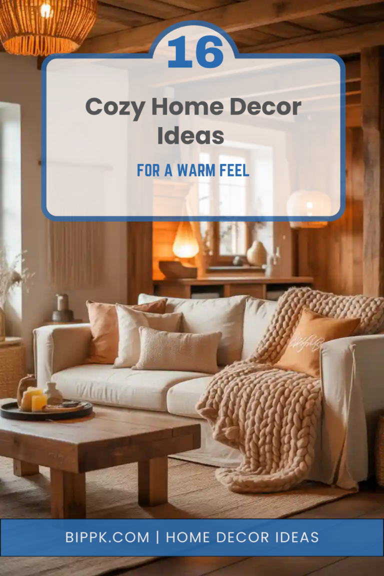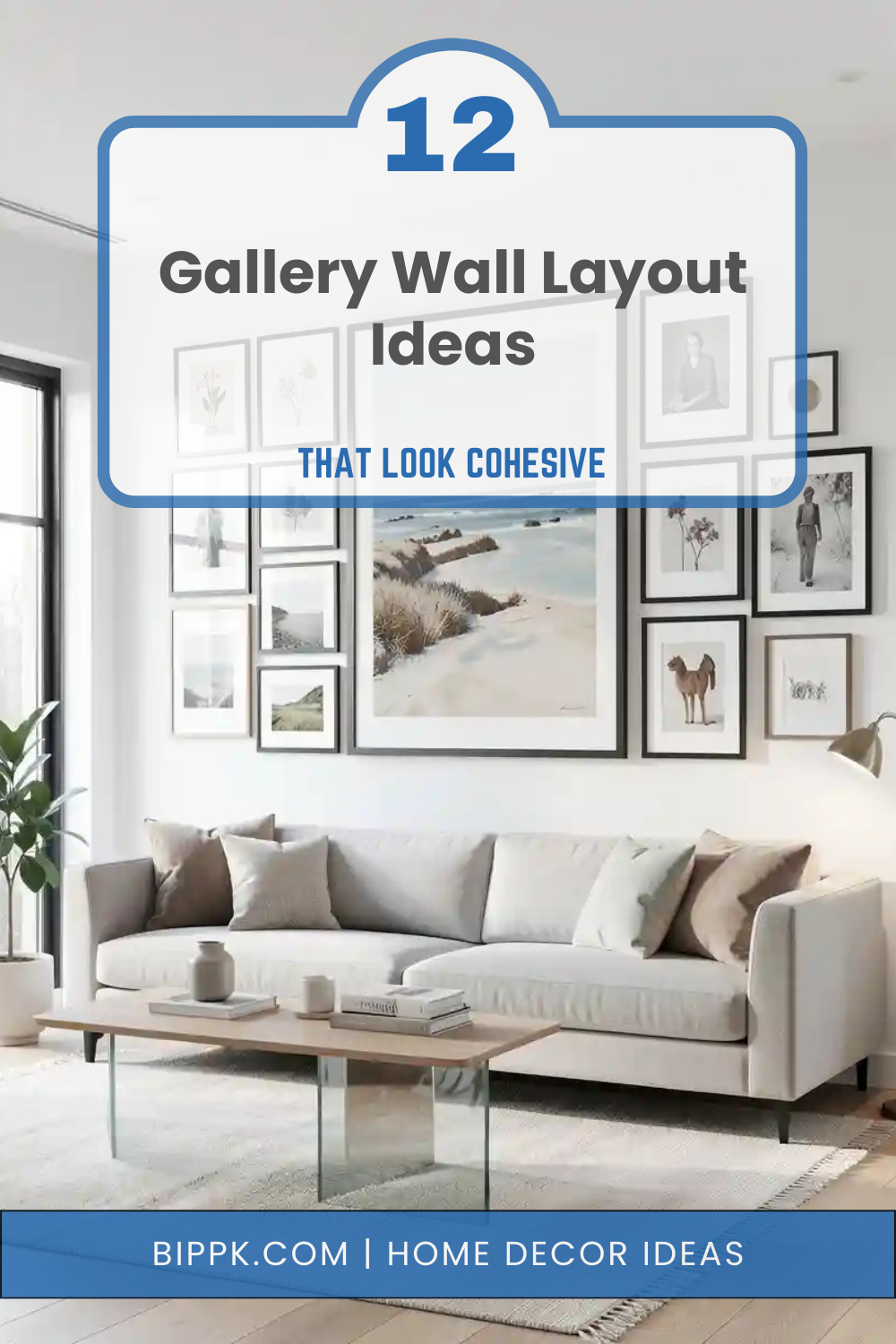
12 Gallery Wall Layout Ideas That Look Cohesive
A gallery wall is one of the most creative ways to decorate your home, allowing you to display artwork, photographs, and prints in a way that reflects your personal style. However, without the right layout, a gallery wall can quickly feel cluttered or disconnected. The secret to a successful gallery wall is cohesion making sure the pieces work together visually while still allowing each artwork to stand out. This can be achieved through thoughtful spacing, balanced proportions, consistent color palettes, or coordinated frames.
A cohesive gallery wall doesn’t have to be perfectly symmetrical, but it should feel intentional and harmonious. Whether you prefer a structured grid, an organic arrangement, or a layered shelf display, the layout you choose will shape the overall look of your wall. With the right approach, a gallery wall can become a stunning focal point in any room. Here are 12 gallery wall layout ideas that look cohesive and beautifully styled.
1. Classic Grid Gallery Wall
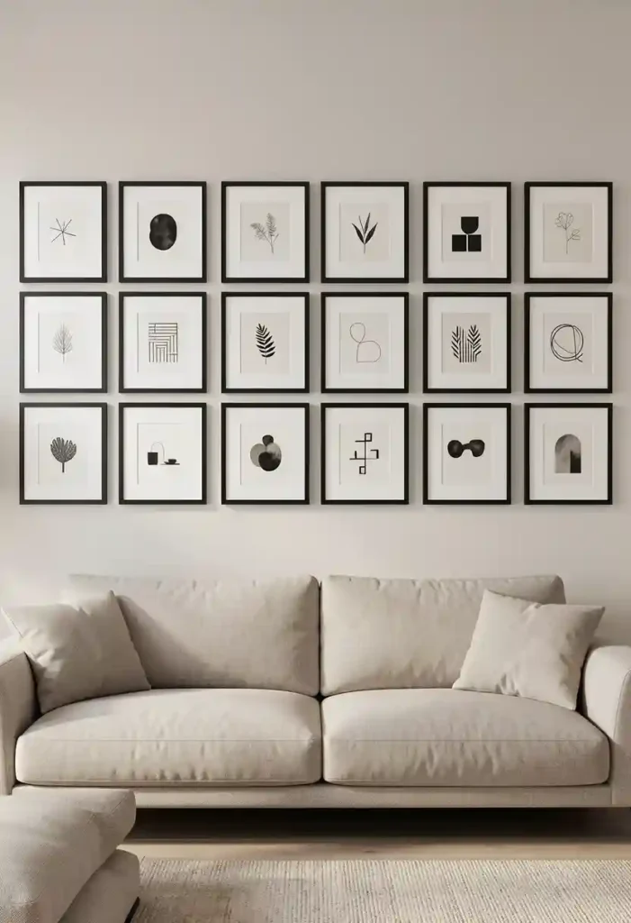
A classic grid layout is one of the most cohesive gallery wall styles because it follows a clear and structured pattern. Frames are arranged in evenly spaced rows and columns, creating a clean and balanced look. This approach works best when the frames are the same size, as the repetition helps maintain visual harmony.
The artwork inside the frames can vary slightly such as black-and-white photos, abstract prints, or minimalist illustrations but keeping the frames consistent ties everything together. Equal spacing between frames is essential, usually around two to three inches.
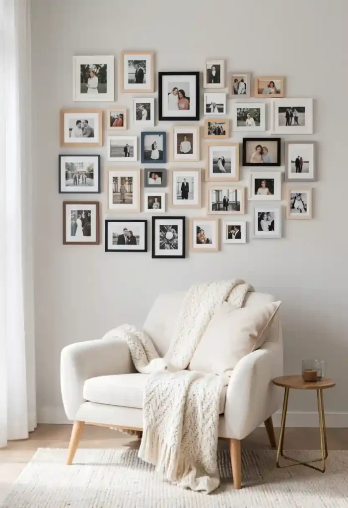
2. Center Anchor Gallery Layout

The center anchor layout creates cohesion by using one large piece of art as the focal point. Smaller artworks are then arranged around this central piece, forming a balanced composition that radiates outward.
The central artwork anchors the display, making the gallery wall feel grounded and intentional. The surrounding pieces should complement the color palette or theme of the main artwork to maintain harmony. Spacing between the frames should remain consistent so the layout feels connected rather than scattered. Even though the pieces vary in size, the arrangement still feels unified.
See Also: 11 Wall Art Arrangement Ideas That Feel Balanced
3. Linear Horizontal Gallery Wall

A horizontal gallery wall arranges multiple pieces of artwork in a straight line across the wall. This layout feels cohesive because the consistent alignment creates visual order and flow.
The frames can either be the same size or slightly varied, but keeping them aligned along the same horizontal axis is key. This arrangement works especially well above wide furniture such as sofas, beds, or console tables. Spacing between frames should remain even to maintain the sense of rhythm across the wall. A horizontal layout also helps emphasize the width of the room, making spaces appear larger.
4. Vertical Column Gallery Wall

A vertical column gallery wall places artwork in a stacked arrangement, creating a cohesive display that draws the eye upward. This layout is ideal for narrow walls or spaces between windows and doors.
Typically, two to four frames are stacked vertically with consistent spacing. Matching frames often help maintain cohesion, but the artwork inside can vary in theme or color. This arrangement works particularly well in hallways, staircases, or entryways where horizontal space may be limited.
5. Organic Gallery Wall Layout

An organic gallery wall uses a relaxed and free-flowing arrangement rather than strict rows or columns. Despite its casual appearance, cohesion comes from thoughtful spacing and shared design elements.
Frames may vary in size and orientation, but maintaining a similar color palette or frame style keeps the display unified. A good strategy is to start with a central piece and build outward gradually, ensuring the spacing remains consistent between each frame.
6. Gallery Wall with Matching Frames

One of the easiest ways to achieve cohesion is by using frames that all match. Even when the artwork varies in style or color, identical frames create a unified structure.
Black, white, or natural wood frames are particularly popular because they blend easily with many interior styles. This layout allows you to mix photographs, illustrations, and abstract art without the wall feeling chaotic. Matching frames also create visual rhythm, guiding the eye smoothly across the gallery wall.
7. Staircase Gallery Wall

A staircase gallery wall follows the angle of the stairs, creating a cohesive layout that mirrors the architectural lines of the home.
Frames are arranged so their centers align with the slope of the staircase. This keeps the gallery wall visually connected to the structure of the space. Photographs or family memories often work beautifully here, but art prints can also create a striking display.
8. Picture Ledge Gallery Wall
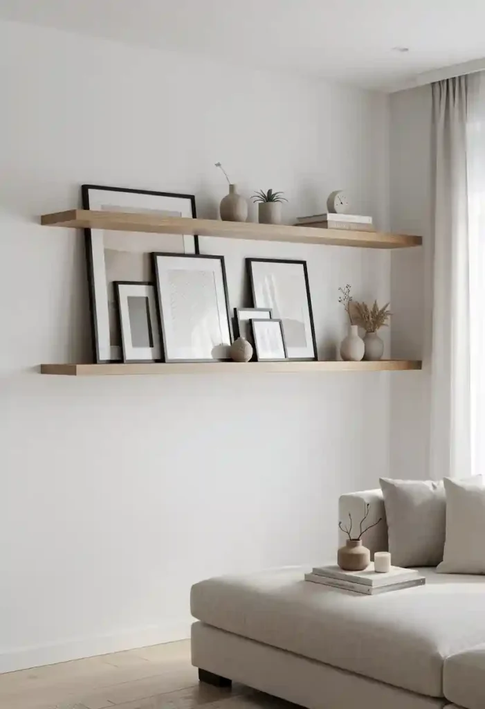
Picture ledges offer a flexible and cohesive way to display art without committing to a fixed arrangement. Frames can lean against the wall and overlap slightly, creating depth and layers.
This setup works especially well for mixing large and small artworks. Larger pieces sit at the back while smaller frames and objects sit in front. Because the ledges act as a base, the overall arrangement feels grounded and unified. Picture ledges are perfect for people who enjoy changing their artwork frequently since the display can easily be rearranged.
9. Symmetrical Two-Column Layout

A two-column gallery layout places artwork in two vertical columns that mirror each other. This structure creates strong visual balance and cohesion.
Frames within each column can be the same size or slightly varied, but alignment between the columns is essential. This layout works well on larger walls where a grid might feel too rigid but structure is still desired. The result is a gallery wall that feels elegant and organized without being overly formal.
10. Frame Cluster Layout
A frame cluster groups several small pieces together in a tight arrangement that forms one visual unit. Instead of spreading art across a large area, the frames remain close together.
Keeping the spacing between frames consistent helps maintain cohesion. Clusters work especially well for small artwork collections or personal photos. Placing the cluster above a chair, console table, or small desk creates a charming focal point. The grouped arrangement gives the wall a curated and intentional appearance.
11. Mixed Media Gallery Wall
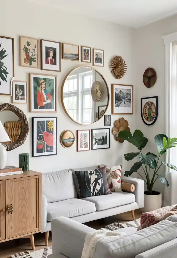
A mixed media gallery wall combines framed artwork with mirrors, woven pieces, or sculptural wall decor. The variety adds texture while still maintaining cohesion through color or theme.
Balancing the visual weight of each piece is important so the wall doesn’t feel uneven. For example, a large framed print might be balanced by a round mirror and a smaller artwork nearby. This layout works beautifully in eclectic or modern homes where variety is embraced. The mixture of materials creates depth and personality while maintaining harmony.
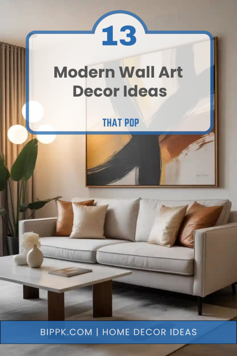
12. Large Frame with Supporting Pieces

This gallery layout uses one oversized frame as the dominant element while smaller frames act as supporting pieces around it.
The large artwork establishes the focal point and helps organize the rest of the layout. Smaller pieces should be spaced evenly and arranged in a way that balances the visual weight of the main frame. This layout works well above sofas, beds, or desks where a strong centerpiece enhances the room.
Final Words
A cohesive gallery wall is all about creating harmony between different pieces of art while still allowing personality to shine through. When frames, colors, spacing, and layout are thoughtfully considered, even a mix of artwork styles can feel unified and intentional. The key is to find a layout that complements the wall size, furniture placement, and overall aesthetic of the room.